Portfolio


Completing my FMX Digital Media program at the University of Tampa has been an enriching journey, challenging me to expand my skills and creativity within the Adobe suite specifically Illustrator, Photoshop, and InDesign. As someone already immersed in the graphic design business, learning these software platforms not only broadened my capabilities but also refined my approach to visual storytelling. From the outset, navigating through the intricacies of Adobe Illustrator to the nuanced editing features of Photoshop, and the layout finesse of InDesign, each phase of this course presented its own hurdles and triumphs.

Throughout this demanding course, I've encountered moments of struggle and growth, from the initial learning curve to mastering advanced techniques. Yet, with persistence and dedication, I've emerged equipped with a comprehensive understanding of Adobe tools that will undoubtedly serve me well in my future endeavors. Compiling this portfolio, I've curated a selection of works that exemplify my creative journey within these platforms, each piece a testament to the evolution of my skills and vision.

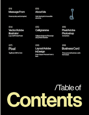
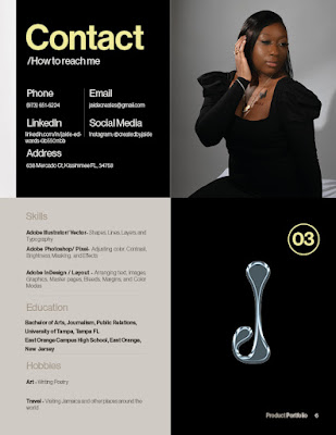
Inspired by a template sourced from Adobe Stock, I envisioned a magazine-style layout to complement my background as a Journalism major with a minor in Public Relations. Incorporating a distinctive blue font, achieved through a text effect also sourced from Adobe Stock, I meticulously edited the contents using Adobe Photoshop to bring my vision to life. This portfolio not only showcases my proficiency with Adobe software but also underscores my commitment to merging design and communication seamlessly in my professional pursuits.


Template & Modified: Portfolio Template

Text Effect Mockup & Modified: Glass Texture Text Effect

Comments

Popular posts from this blog

BW to Color

  The strong emotional connection this image embodies led to the choice to colorize it from black and white. It was taken at a special photo session with my mother and captures the love, enduring bond, and trust that exist between us. When the artwork was first created in black and white, it had depth and inspiration that never went out of style. However, adding color again gave it fresh vibrancy and made the scene happier and more cheery. The vivid colors not only made the scene more visually appealing but also reflected the warmth and excitement that filled our relationship, turning a lovely moment into a spectacular celebration of connection and love. BW TO COLOR

Business Card

Using InDesign, I was able to incorporate deep symbolism into each design to create personal business cards that truly reflected who I am. The first card represents the light I bring into people's lives; it has a captivating eye. My presence brings joy and support, much like the eye is a window to the soul. The vivid green color represents my name, Jaide, like the priceless Jade stone. The second card, with the initials "JG," pays tribute to my ancestry and my great-great-grandmother's name Georgiane. Finally, the third card's bright blue color represents my zodiac sign, Pisces, which is a sensitive and adaptable water sign. These cards were mostly created by hand using InDesign's rectangle tool to create the color backgrounds. In order to achieve the ideal colors and make sure every shade had the intended meaning, the Adobe Color Wheel was essential. Using the fill Gradient tool to provide depth and dimension, the second card's design was a particularly ...